Dawid Batog

A blog/portfolio documenting each unit of my work
UNIT 1 - Introduction to Visual Language in Art and Design
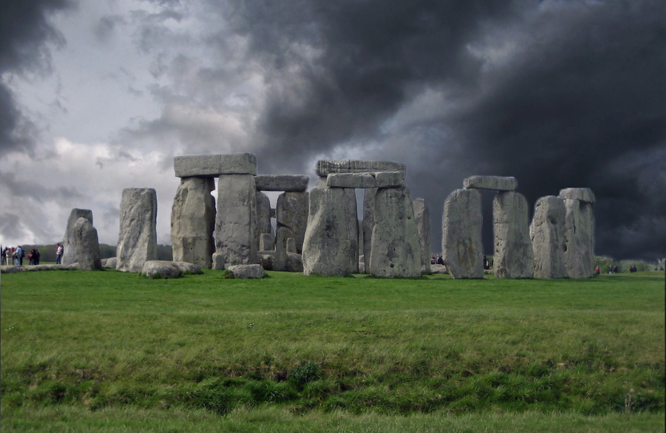
To understand the basics of masking I have been given two images, one of a stormy sky and the other is of Stonehenge.
To first remove the background I've attempted to use the ''Eraser Tool'' but quickly learned that using that method is very time consuming and is much more difficult than other methods. I then learned of the "Quick Select Tool" which selects areas of the layer based on the colours surrounding the area.
By using the ''Quick Select Tool'' I was able to select the entire background and mask it using the ''Add vector mask'' tool. For the Stonehenge to be on top of the stormy sky I had to make sure that the Stonehenge layer was the first one and the sky layer was the second one.
To touch up the glow that the previous background left around the Stonehenge I used the ''Smudge Tool'' and very carefully started 'smudging' the black areas of the 'vector mask' with the white areas. This left me with a stonehenge image that used the background of the stormy sky.


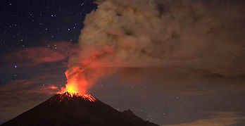
Following the same steps, I've described previously but using two different images that I've found, I've created a combination of an image of Stonehenge and an image of a volcano eruption occurring in the background.
To begin merging both images together I first had to horizontally flip the image of the volcano and then stretch it slightly upwards so that the Stonehenge wasn’t in the way of the volcano's peak. I then used the "Quick Select Tool" to select the background of the Stonehenge image and using the "Add Vector Mask" tool I masked it with the image of the volcano. I specifically looked for an image of Stonehenge with an orange glow so that the image of the erupting volcano would be more believable but the glow given off by the background was too bright in some areas so I once again used the "Smudge Tool" to touch up on the areas where the glow was too bright for the image.


Having already created two compositions I started creating another one using two images, one of a mountain peak and another of space. Once again I've used the "Quick Select Tool" and "Create Vector Mask" tool in order to combine the background with the image..
I've decided to try to experiment slightly by adding a smaller image to the composition for a more comical effect. As this composition was space themed I added a picture of a 'bear' in a space suit and added it to the background. When masking both images I decided to make the 'Bear' layer slightly more transparent to add a more 'spiritual' effect to the image.


Artist Research:
David Hockney:
The artwork of David Hockney can be interpreted as post cards. He creates landscape paintings of many different areas and applies the "Rule of Thirds" to his work. He paints using very vivid colours that bring his paintings to life but at the same time creating a very surreal atmosphere.
 |
|---|
 |
 |
 |
 |
 |
 |
 |
 |
 |
 |
 |
 |
|---|
 |
 |
 |
 |
 |
 |
 |
 |
 |
 |
 |
 |
 |
 |
 |
 |
 |
 |
 |
 |
|---|
 |
 |
 |
 |
 |
 |
 |
 |
 |
 |
 |
 |
 |
Doug Craft:
The work of Doug Craft appears very bizzarre and nonsensical however all of his collages are aesthetically pleasing. Each collage provides a humorous setting and some of them play around with past historical events.
All of his collages have very distinct colours that complement each other creating a more vibrant composition.
Crafts work ranges from traditional art to digital art.
John Stezaker:
The work of John Stezaker is very surreal but yet captures exactly what the image needs in order to work. In many of his works he combines two or more separate images into one by collaging the photographs together and creating a new piece. All of the people that he combined have similar head shapes meaning that the heads will join easier and provide a smoother transition He has also created a collage of people combined with a cut-out from something completely unrelated creating a composition with a meaning where originally there was none.
Idea Brainstorm:
-
An image of one of the first cameras with a little artist painting the photo inside
-
A common household printer printing out a real 3D car
-
The moon landing on a film/tv stage (already a conspiracy theory)
-
A ticking phone-bomb, weaponized phones (as phones get more powerful companies can do more and more with them)


As I began to work I first started working on the idea of the ''Painter Camera''
I first had to mask the background as it was a gradient and it did not allow me to change aspects of the camera freely.. To do that I've used the "Create Vector Mask" tool. I was told that removing a side of the camera to 'look inside' would be too difficult at the moment and so I decided to put the artist at the back of the camera. I then began removing the back part of the camera to add space in which I can put the painter by painting additional black, using the "Brush Tool" onto the "Mask" layer. After successfully removing the back flap I began cutting out the painter from a stock image I've found on the Internet. I then resized the painter and positioned him at the space that I've created earlier.
I now realise that this idea was not very well thought out and so I will only leave this as an experiment.

Meanwhile I was also learning how to apply a chroma key. To do this I've been given an image of a sky background and a photo of a lady in front of a green screen. I must distinguish why a green screen would not be suitable for the Stonehenge image. I believe it is because the image of Stonehenge does not have as much detail as the hair for this image therefore not as much precise selecting has to be done furthermore It would be very expensive to acquire a sreen screen as big as Stonehenge. To begin I've made sure to have both images in the same file. Then to select only the green background I could have used the ''Quick Select Tool'' however human hair is quite thin and therefore the tool has some difficulty distinguishing it from the background. To select the entire background without accidentally selecting parts of hair I clicked Select > Colour Range and made sure to correctly pick out the green from the image. When all of the green was selected I've masked the selection to make sure I get rid of the green screen in a non-destructive method. After this my task was completed however as seen on the right the picture suffered from what’s known as 'Colour Bleed'. It is when the background colour 'bleeds' onto the main focus leaving behind a slight glow around the object. To remove this glow an artist must adjust the hue and saturation of an image sacrificing some colour and vibrancy in return.
The finished product can be used as an identification photo.


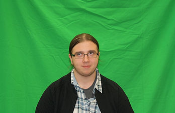
This time instead of finding stock images online I was tasked with taking a green screen photograph of me.
The very first thing that came up as an obstacle was the fact that the green screen was not perfectly stretched out and had wrinkles on it making the process of chroma keying much more difficult. After successfully masking the majority of the green screen, by selecting the colour green using ''Colour Range'' and masking it using the ''Layer Mask Tool'', I was left with just me on a white background however the photograph suffered from a lot of colour bleeding. To remove this bleeding I've had to adjust the Hue/Saturation present in the image and therefore sacrificing some of its vibrancy. The main focus of this exercise was experimentation so to explore further I wanted to set a mood to go along with this image. My idea was to have me experience something psychedelic as I look into the nothingness as the photograph of me is nothing but just me looking off into the distance. I experimented more and more with the ''Fill'' function and its ''Content Aware'' feature I quickly realised that that was not what my image was going to be. It turned out to be a creepy rendition of me, missing my facial features, with a psychedelic background. Originally the image was not meant to have a meaning but with this edit it just might have one.
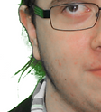


For this photograph I had a much more refined idea.
I followed all of the steps mentioned previously (chroma keying, masking and removing colour bleeding) using an image of me in a thinking pose. My idea was to create a custom playing card featuring me instead of the usual art.
As all art featured on traditional playing cards is mirrored I duplicated the layer with me on it and flipped it horizontally. I then found an image of a playing card (The King of Spades) and masked out the original art. I proceeded to insert the two mirrored layers onto the card. Upon further investigation I've noticed that the art has the symbols in the top-left corner and the bottom-right corner so I copied those from the original card and pasted them onto my image. Looking at the art of the cards I've noticed that all of the characters are rounded off and do not have any spiked edges meaning that they are conjoined symmetrically, in order to make my card more authentic I touched up on parts where the two copies weren’t joining by first merging both layers together and then filling the spaces with the ''Fill'' function and the ''Brush Tool''.


As a small side project I wanted to develop my idea of ordinary household printers creating a real car. I first gathered three images that would be used to create the image.
To begin I’ve had to remove the paper tray from the printer using the “Mask Layer” tool. I selected the paper tray using the “Pen Tool” and mapping out the paper tray. I then did the same to the open garage door but this time instead of masking it I’ve masked everything but the garage door. I then warped the garage door using the “Warp” and “Perspective” options under Edit > Transform.
After inserting and adjusting the garage door I began masking out the car from its background. To do so I once again used the “Pen Tool” to map out the shape of the car by creating anchors and connecting them together to create a selection. I then inserted the car into the image of the printer and masked the car so it looked like it was just coming out of the printer.
To finalize the image I touched up on small bits of the image that were off such as a very thin strip of brick that was left over from the original garage door image.


I've been working on my moon landing idea. To begin I needed to find an image of a large studio with a green screen in it.
I needed a way to portray that the green screen is there to fake the moon landing so I've found an image of a monitor on a tripod and added it to my picture. I then took the original image I got the astronaut from and manipulated it in order for it to look like as if it’s on the monitor screen. I then cut out the image of the astronaut and re-scaled it to fit with the mage of the studio. To give the impression that the astronaut is actually at the studio I copied the astronaut layer and warped it to look like a shadow dropping on the background, I then filled it with a darker shade of the green used for the green screen.
I positioned the astronaut slightly to the right following the 'Rule of thirds' to make sure my image looks appealing to the eye.
I then positioned the monitor slightly to the left to also comply with the 'Rule of thirds'.
I do believe that more can be done to make the image seem more genuine however this is how I've decided to leave the image as In my opinion it captures the idea well and I was running out of time.


The main task was to create a postcard based on a historical event however I felt like my moon-landing photo did not fit the postcard style.
And so I began by choosing a new historical event, this time I chose the first ascend of Mount Everest, which happened in 1953.
Firstly I gathered an image of a climber climbing Mount Everest and an image of space. I chose an image of space for the background, as I believe this reflects the views of people at the time as nobody else in history has ever scaled a mountain so high before and therefore people did not know what to expect when someone got to the top.
I also got an image of a postcard stamp as I am going to create my own one based on what a postcard stamp looks like.
I began by layering both images in one file and making sure that the space image is set as the background. Then using the "Quick Select" tool to select the sky and then I used the "add Vector Mask" tool to mask the sky.
I then changed the saturation of the image by clicking on "Hue/Saturation". I changed the saturation to -100 in order to make the image black and white as back then most images were taken in black and white. This creates a sense of authenticity.
After that was done, I began working on my custom stamp. I first created a white circle with a black outline by using a mix of the "Elliptical Marquee Tool" and the "Paint Bucket Tool".
I then used the "Horizontal Type Tool" to create the text that would go on the stamp. I used the "American Typewriter" font, as it was best suited for a stamp. In order to make the text wrap around the circle shape I right-clicked the text layer and clicked on "Wrap Text" and chose the "Arc" preset. I then changed the value of "Bend" depending on if the text would be at the top of the circle or bottom (+100 or -100 respectively).
I copied the swirly lines from the original stamp in order to make my custom stamp more authentic.
Finally I placed my custom stamp into the file and positioned it in the top-right corner where stamps are usually placed.
Most postcards include some sort of title/text that describes the current image and therefore I wanted to add some text to my postcard. I used the "Horizontal Type Tool" and using the "American Typewriter" font I typed out what the postcard is meant to represent, the first ascent.
Lastly I exported the image as a PNG so it’s ready for use anytime.

The stamp I've found online

The stamp I've created

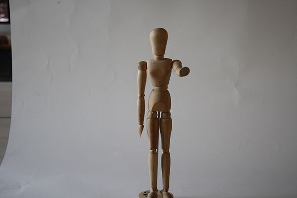
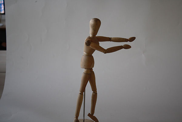
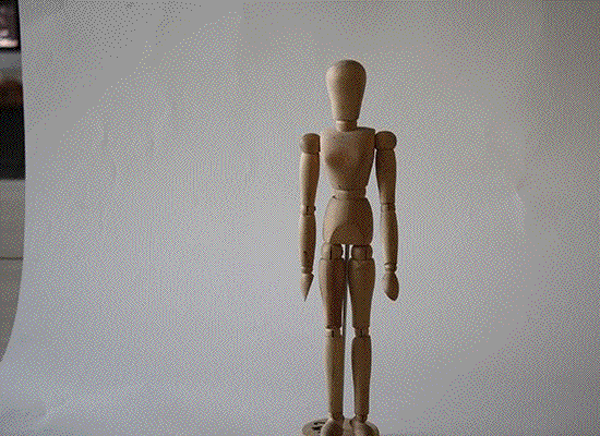
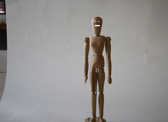
We were also experimenting with stop motion using a model of a human body. The group I was assigned to decided to animate the model in a way so that it does the 'hadouken'. After compiling it in after effects I exported the singular images as a gif. I also experimented with using flash as a medium for the effects but did not try too hard at making anything too realistic.