Unit 10 - James Bond Title Sequence
To begin I've been tasked with brainstorming a general idea for my James Bond title sequence, I've chosen to name the sequence ''Black Skies'' due to my choice of music that I've explained later. To find the best name for my sequence I've listened to my selected song and I wrote down all of the words that struck me from the lyrics of the song and then I've chosen the best lyrics that would fit a James Bond theme. For my villain I've chosen to focus on the current struggle with North Korea as it intrigued me with the amount of weapons it is boasting that it has. It also makes it easier for me to chose an overall 'final boss' as that can be Kim Jong Un seeing as he is the political leader of North Korea. Choosing North Korea also helps me deepen the meaning of the name I've chosen for my title sequence as ''Black Skies'' can be taken as a double meaning. It is fairly obvious that it might symbolise that the time of the day is night but with my approach, it can also symbolise a sky full of smoke from an explosion of sorts.
For the first song I've looked at the previous songs used in James Bond title sequences, the one that caught my attention the most was ''From Russia With Love'' as in my opinion its the most recognisable of the ''Bond Themes''. The song has very recognisable and almost cliché strong melodies that are associated with the James Bond franchise.
I was not planning to use the music for my sequence as it would be too easy of a task to use music that was already made for the James Bond franchise however it did give me a good idea of what to look for in a song when searching for other pieces of music.
This piece of music has a very strong resemblence to music used for a James Bond title sequence. It features strong melodies with a powerful female singer and an overall eerie but calm composition that sets a very specific mood that is perfect for the James Bond franchise.
In the end I did not use this music as the lyrics focus too much on something called ''The Spine'' which is one of the focuses of the game that the song was written for.
This song struck me as being a very good candidate for the song I would like to use in my title sequence. It features a very strong female singer and deep melodinc sounds. It has a funky spin to it however adding a more modern beat to the background of the clasicall composition setting a perfect theme for a more modern based James Bond movie.
Just by listening to the song I've ad many ideas on how to interpret the lyrics into different scenes of the title sequence and because of the impression that left on me I've chosen to use this song for my title sequence.
I've been tasked with presenting a moodboard to express the emotions that I want my title sequence to present.
 |  |  |
|---|---|---|
 |  |  |
 |  |  |
 |  |  |
 |  |  |
 |  |  |
 |  |  |
 |  |  |
 |  |  |
 |  |  |
 |  |  |
 |  |  |
 |  |  |
 |  |  |
 |  |  |
 |

I've also been tasked with presenting a storyboard for my James Bond Title Sequence, below is my rough storyboard which I will build upon in the final version.
To begin with the software known as After Effects we first had a friend record himself doing an action in front of a green screen.
After that was done I started experimenting with the green screen by using Keylight 1.2 in After Effects to remove the green from the image and then putting the video with different backgrounds for different effects.
Ultimately I've decided with this video to be the representation of my experimentation as its plain, simple but effective in showing the results that can be achieved.
I then downloaded a couple of videos that cannot be replicated using our resources such as fire or smoke. I experimented with the smoke by creating a kaleidoscopic effect but it felt slightly bland so I created a silhouette of another green screen recording done by a classmate.
This time, the recording was of him reloading a gun. I mirrored the gun in the same way I mirrored the smoke and gave it a silhouette look by modifying the colour 'curve' on the video.
In this video I experimented with using the Simulation Effect known as ''Pixel Polly". The effect makes the video 'shatter' into several pieces determined by the settings used. I tried making the text appear as if it was shot by the silhouette in the video and so I've tweaked the settings of the Pixel Polly to accordance with the video of a classmate.
To make the silhouettes into a white/different colour I've had to use another effect called ''Change To Colour'' that allows me to change a specific colour, in this case black, to any other colour, in this case white.
This is the final project of my experimentations. Although it is rough around the edges (some blur and sharpening issues + pacing) the general idea of what I was aiming for can be seen. I've combined the previously shown videos into a single creation whilst having a transition in-between the two shots. Creating the transition was the most difficult part as it required that I render the single frame of the movie at a specific keyframe, after that was done I had to simultaneously edit the video's position, scale and rotation in order to blend the two different clips together. I added some detail into the two clips such as adding fire and making the silhouettes white and replacing the text with another video of a classmate. I hope to improve upon the mistakes in the video especially the issue where the difference in quality between the gun transition from one clip to another was far too great.
To make my James Bond Sequence more inspired by other media I've set out to find any Artist/Creator that could influence my current work.

Saul Bass
To make my James Bond Sequence more inspired by other media I've set out to find any Artist/Creator that could influence my current work.
Saul Bass was a well-known graphics designer. He created some of the most popular motion graphic sequences and some for the James Bond franchise. His work is heavily based on opaque colours and silhouettes and how they interact with each other to portray information such as credits. I will be using his silhouette style in my work in order to make it more stylized.
''Bad Apple''
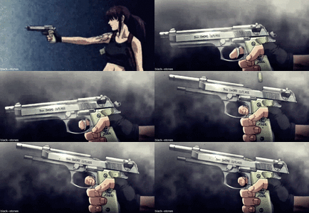
Maurice Binder created the signature gun barrel sequence for the first Bond film ''Dr No''.
After that, the title sequence has been used in most of the James Bond title sequence.
I will attempt to re-create this sequence in order to make my title sequence feel more authentic however I want to give the sequence my own little spin on it by possibly using green-screen footage of one of my classmates.

This video, created by artists from Japan, is heavily focused on silhouette art and smooth transitions to create a smooth flowing visual piece that accompanies the music. By only using black and white as the main colours the transitions between the scenes are much easier to create and they also flow with each other very well creating the 'smooth' viewing experience I mentioned earlier.
I will attempt to transition my scenes the same way in order to try to achieve the same level of flow as shown in ''Bad Apple''
Maurice Binder


I began working on the Maurice Binder inspired intro to my title sequence. I could create the whole motion graphic of the moving circle however that would take too much of my time and therefore I've decided to use stock footage online and replace the green screen within the footage with some footage of a classmate 'shooting' in the direction of the camera.

Inspired by the moving transitions of ''Bad Apple'' I've created several moving graphics on the screen that flow with each other to create different scenes from my original storyboard.
I wanted to inform the viewer of the fact that this is a James Bond title sequence and so I've decided to reveal the '007' logo with a linear gradient as the car silhouette passes by to once again create a smooth flowing visual experience .
In these two scenes I've continued to follow my storyboard whilst using transitions such as Pixel Polly to progress the sequence forward. I've used a custom font for my title as I felt it fit the theme of the project more.
Once again I've attempted to innovate whilst transitioning in-between scenes. This time I've decided to invert the colours of the scene when a gun is fired as I've felt like that would be an appropriate way of introducing a darker colour scheme without subtracting from the already used colours. Inverting the colour scheme is a running theme in ''Bad Apple'' and it is mainly where the inspiration for such a transition came from.
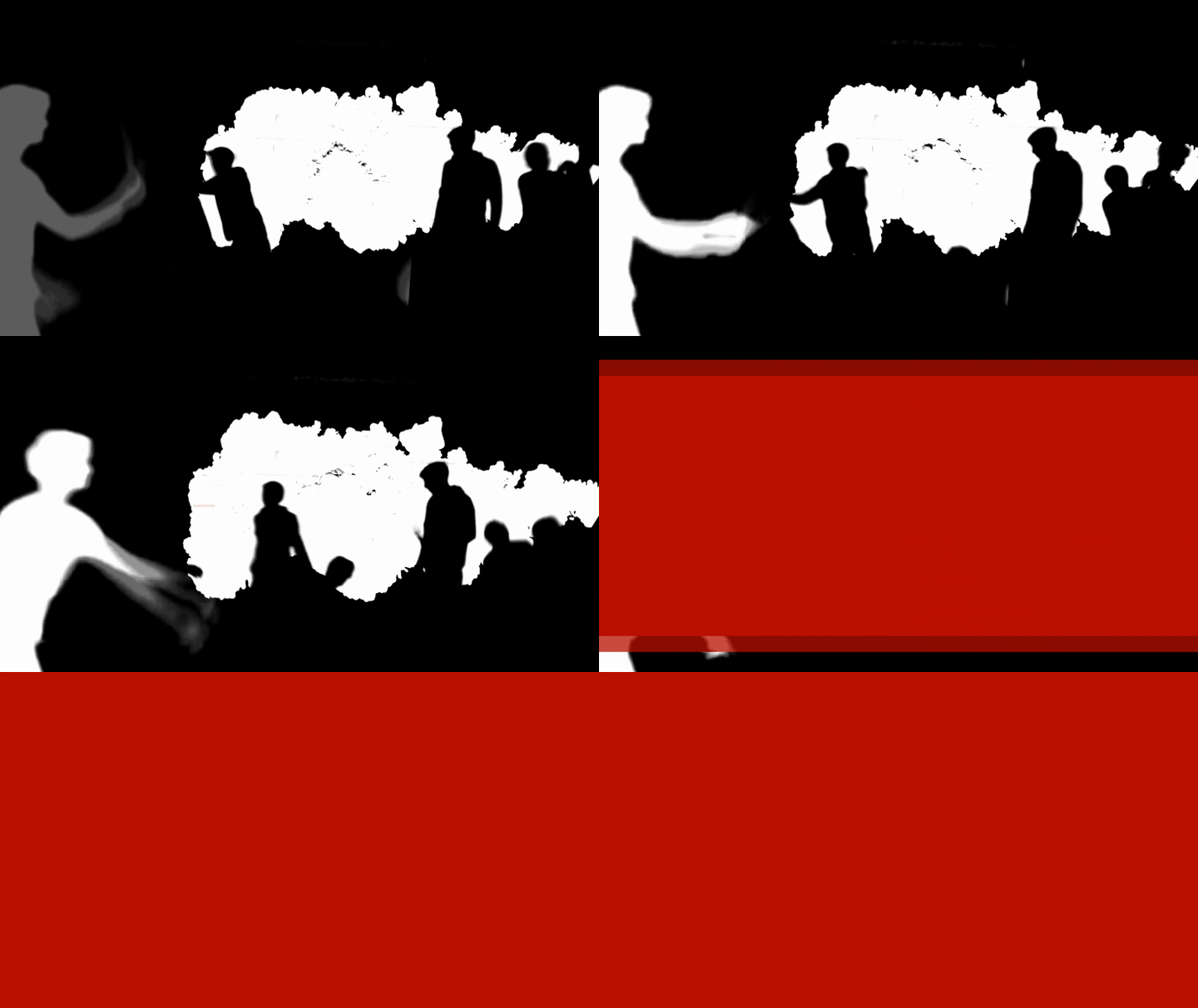
By using the ''Difference'' setting on the stock footage of ink in water I was able to create an effect where I can overlay silhouettes over the footage of ink whilst also having some footage of blinking lights behind the ink but not in the way of the silhouettes.
The ink is meant to represent the blood coming from the different people that have been killed and the silhouettes within the ink are meant to represent the different ways that the people have been killed.
I've experimented with this scene in several ways, the ink was originally going to be red however that proved to interfere with the smooth flow of the scene. I've also had more than one ink in the scene but that proved to be too cluttered and so I've decided to stick with only one ink shot in black and white.
Following my storyboard I've decided to represent the theme of North Korea more by using specific imagery linked to korea/asian-themes, which is why I've used the imperial japan flag as it has a very prominent look and fits the colour scheme that I've already established.
For this scene I've had a green screen of a classmate shooting a gun and I've had ink shoot out of it. I've then used green screen silhouettes of my classmates re-enacting different 'kill scenes'. This scene was mostly created for extra effect and did not have any extra significance to the story however I've still decided to stick to the storyboard and I feel like using the storyboard has really helped me to stick to what I was trying to portray rather than branching off into abstract territory.
Over the course of this project I've been attempting to create fluid transitions throughout the whole project, here I have created a transition that follows the path of the knife that was thrown from one of the silhouettes. I think this creates a fluid transition that does not clutter the screen to much.
I've decided that the final scene of the project will be in the same setting as the beginning of the title sequence as this would create a bigger impact on the viewer and suggest some deeper meaning within the title sequence. I did however create subtle differences in the scene such as having the city silhouette in the background being destroyed and having smoke behind the silhouette suggesting that North Korea has attacked the city. To once again create an impact on the viewer I've decided to have a sudden ending to the title sequence that would leave the watcher wanting to know what happened and craving more which is perfect as the title sequence is there to introduce the viewer to the story and leave them wanting more.
This is the final result of my work over this Unit. I am very proud of what I have created as I believe that I've managed to implement different elements of my research such as silhouettes, smooth transitioning, opaque colours and a James Bond feel throughout the title sequence that I've created. I believe that there is some things I could have improved on. First, the camera used to record the green screen footage was not very high quality and therefore when enlarging the footage it became more blurry.
I could also create more transitions for the different silhouettes as sometimes I've had to resort to using the opacity as a way of transitioning some of the silhouettes into the scene and therefore detracting from the fluidity of the project which is something that was a big focus for me throughout this unit. I also believe that I could have made the theme of North Korea more prevalent throughout the title sequence as there is only two scenes in the whole title sequence that really reference North Korea and that might confuse the viewer as to what the main focus of the movie is. I still believe that even though there is much to improve in my title sequence it still portrays a James Bond title sequence and because of that I believe that the video I've created was successful.
